

Tested HQ
Bridging the gap between Testers and Researchers
In partnership with Tested HQ, this project bridged the gap between product testers and researchers through a dual-platform ecosystem. The solution featured a mobile app for on-the-go tester reviews and a desktop dashboard for efficient researcher management and recruitment.
Role
Protoyping, Interaction design, Layout design
Timeline
5 months
Team
Kevin, Melissa, Brianna
Tools
Figma, Figjam, Photoshop
Here is a brief project breakdown to quickly skim
Quick Overview
What did I do?
Led interaction design, UI visual design, and prototyping for both desktop and mobile applications, focused on communication between testers and researchers.
Why was it done?
Tested HQ needed solutions to streamline how real product feedback is shared, analyzed, and acted on between both user groups.
What impact did it have?
The final designs established a clear, scalable communication system that streamlined user engagement and communication across both platforms.
What did I learn?
I learned that simplifying complex ideas early creates stronger and more purposeful design outcomes. This also helps teams pivot successfully toward more realistic and impactful solutions.

Problem
Tested HQ needed a better way for researchers and testers to communicate and collaborate. The existing feedback process was disjointed, making it difficult to share insights effectively. Our challenge was to design a connected experience that streamlined communication and empowered both sides to improve product development.
Creative Solution
Tester Solution
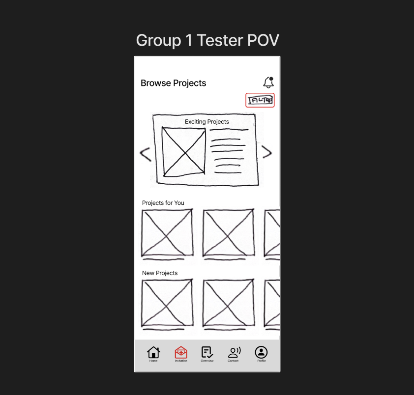
This mobile application streamlines the tester experience by consolidating surveys, interview scheduling, and reward tracking into one platform. The user-friendly interface ensures testers can complete tasks and submit feedback with minimal friction.


Researcher Solution
The desktop application provides a customizable workspace where researchers can manage projects in their preferred layout. By integrating targeted participant filtering with built-in messaging and video tools, the platform streamlines the entire recruitment and communication process.


Research
Market Research
Researcher Oportunities
-
Growing demand for platforms that combine communication, workflow, and file sharing.
-
Opportunity to develop customizable dashboards for data and project management.
-
Market interest in built-in survey tools for easier research and feedback collection.
-
Need for integrated video conferencing and calendar scheduling to improve collaboration.
-
Value in ensuring cross-platform functionality with mobile applications.

Tester Oportunities
-
Opportunity for seamless integration with existing mobile and web platforms.
-
Increased interest in in-app survey systems for real-time feedback collection.
-
Market need for customizable survey options that adapt to various research goals.
-
Preference for simple, easy-to-use survey interfaces that boost participation rates.
-
Value in maintaining cross-platform functionality between mobile and desktop.

User Research
Persona | Tester
Key Needs
-
More interactions outside of surveys and a bit more feedback from the research results
-
A way to see the impact of their testing and surveys
-
Readable and easy-to-navigate screen in various weather conditions

User Story | Tester
As a tester (Tradesman, hobbyist), I want to participate in real-time chats, live calls, surveys, interviews, polls, and product testing on a mobile device to improve the powerful tools that researchers are developing for us.

Persona| Researcher
Key Needs
-
Tradesmen are vetted and experienced in doing product research.
-
An effective tool for collecting findings into a clear, simplified report.
-
Find production problems and successes for products.

User Story| Researcher
As a researcher (Designer, engineer, marketing, corporate employee) I want the desktop dashboard to aid in constructing projects with criteria filters, instantly located and generated contextualized data to understand tester's bjectives, challenges and needs conserning the product.

Phone App Development

Flow Chart| Tester
-
Received Video Call invitation
-
Connect & Participate in interviews and surveys
-
Review Completion
-
Status Updates

Low Fi wireframes
Brainstorming User Flow into quick low-fidelity wireframes for quick ideation. These low-fi sketches were refined with the help of quick user testing.

Midfi Wireframes
Focusing on refining the ideas that came from the low-fi wireframing with a focus on layout and typography. These midfi wireframes were prototyped and used in multiple rounds of user testing as explained below in the testing phase of the project.
Desktop App Development
Flow Chart| Researcher
-
Filter through testers
-
Send invitation
-
Connect and collaborate through interviews, surveys, and polls
-
Review the interaction

Low Fi wireframes
Brainstorming User Flow into quick low-fidelity wireframes for quick ideation. These low-fi sketches were refined with the help of quick user testing.

Midfi Wireframes
Focusing on refining the ideas that came from the low-fi wireframing with a focus on layout and typography. These midfi wireframes were prototyped and used in multiple rounds of user testing as explained below in the testing phase of the project.

Testing
Throughout the creation of this design process, our designs underwent three rounds of user testing. Two of these user tests were conducted externally with Tested HQ users, and one of the tests was conducted internally.
Tester Phone App Testing
Test 1
Task 1: Scroll through potential projects and use the filters to narrow the search.
Task 2: Check your project initiations.
Task 3: View your projects with a calendar and see your past projects.
Task 4: Connect to researchers through chat, video call, or phone.
Quick engagement and connection
All participents liked the intuitive connecting to researchers through char, video call, or phone call. All comented that they wanted to see more of this interaction.
Instent connection
"Instant connection between users and testers is something we don't have but would love to see ideas toward." - User Quote
Already existing interactions
Many of the capabilities provided we have in our existing portal

Internal Testing
Task 1: Scroll through potential projects and use the filters to narrow the search
Task 2: Check your project invitations
Task 3: View your projects with a calendar and see your past projects.
Task 4: Connect to researchers through chat, video call, or phone.
Quick engagement
All participants immediately interacted with notifications and incoming calls, showing that the call-to-action elements were clear and visually effective.
Smooth Connection Flow
Participants successfully connected with contacts and described the experience as “straightforward.”
Functional Rating System
Users located and used the star-rating feature without guidance, indicating strong discoverability.
Clear End Steps
Later stages of the call process were understood easily.
Second Page Navigation
Some confusion arose around what to do on the second screen after initial engagement.
Call Button Clarity
Button color choices made it unclear which one answered or ended calls.
Incoming Video Calls
Users were uncertain how to handle or locate incoming video calls, suggesting a need for clearer visual prompts or instructions.
Text Readability
The message screen’s text was too small, impacting accessibility.
Key Takeaways
Direction Change from Test 1 prototype
Based on the feedback we felt that transitioning our user interaction to be more focused on how the testers and researchers connect made our project turn into a different more connection focused direction.

Desktop Application Testing
User Testing Tasks
Task 1: Explore a project and ad some testers to the project
Task 2: Connect with a tester
Task 3: After your call with a tester rate your experience on communicating with the tester.
Task 4: View your transcript files and project response info.

Insights
What Went Well
Quick engagement
All participants immediately interacted with notifications and incoming calls, showing that the call-to-action elements were clear and visually effective.
Smooth Connection Flow
Participants successfully connected with contacts and described the experience as “straightforward.”
Functional Rating System
Users located and used the star-rating feature without guidance, indicating strong discoverability.
Clear End Steps
Later stages of the call process were understood easily.
Areas for improvement
Second Page Navigation
Some confusion arose around what to do on the second screen after initial engagement.
Call Button Clarity
Button color choices made it unclear which one answered or ended calls.
Incoming Video Calls
Users were uncertain how to handle or locate incoming video calls, suggesting a need for clearer visual prompts or instructions.
Text Readability
The message screen’s text was too small, impacting accessibility.
All participants immediately interacted with notifications and incoming calls, showing that the call-to-action elements were clear and visually effective.
Participants successfully connected with contacts and described the experience as “straightforward.”
Users located and used the star-rating feature without guidance, indicating strong discoverability.
Later stages of the call process were understood easily.
Desktop Application Testing
Test 1
Task 1: Create a new project and choose the details.
Task 2: Submit the project for approval and then begin to view the potential testing pool.

Wonderful filtering and User selection
Love the filtering and user selection, lead and prioritize that experience.
User Task Re-focus
Look to establish the connection, collect the data, and then store it. Instead of build project, find testers, invite.
Confused on submiting project
Unclear about the submitting the project for approval.
Internal Testing
Task 1: Explore a project and ad some testers to the project
Task 2: Connect with a tester
Task 3: After your call with a tester, rate your experience on communicating with the tester.
Task 4: View your transcript files and project response info.Quick engagement
All participants immediately interacted with notifications and incoming calls, showing that the call-to-action elements were clear and visually effective.
Smooth Connection Flow
Participants successfully connected with contacts and described the experience as “straightforward.”
Functional Rating System
Users located and used the star-rating feature without guidance, indicating strong discoverability.
Clear End Steps
Later stages of the call process were understood easily.
Second Page Navigation
Some confusion arose around what to do on the second screen after initial engagement.
Call Button Clarity
Button color choices made it unclear which one answered or ended calls.
Incoming Video Calls
Users were uncertain how to handle or locate incoming video calls, suggesting a need for clearer visual prompts or instructions.
Text Readability
The message screen’s text was too small, impacting accessibility.
Key Takeaways
Direction Change
After this first user testing our team decided to change the project direction to be more centered around the "establishing connections and the communication" aspect of the researcher to tester interaction.

Final Design Insights
Throughout the creation of this design process, our designs underwent three rounds of user testing. Two of these user tests were conducted externally with Tested HQ users, and one of the tests was conducted internally.
Tester App
Insights
I learned how to simplify complex tasks for mobile users through clear visuals and smooth interactions. Designing ways to keep testers active in testing new products by giving them reward incentives got lots of positive feedback. The slight gamification makes sure testers can easily understand surveys and stay engaged through rewards and intuitive design.


Researcher Desktop Application
Insights
I learned how customizable tools can improve workflow by letting researchers organize their space and filter data easily. I also learned how to design clear information layouts and built-in communication features made managing projects and connecting with testers more efficient.